I’m a sucker for oddly-colored hair. I once went out with a guy just because he had fire-engine-red hair. WORST DATE EVER.
My own locks have been red, purple, blue, tangerine, magenta, and a combination of black and yellow, before settling into a long stint of ash blond. The past decade has been all natural, however.
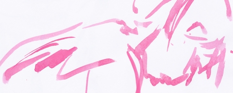
I encountered a picture of a guy with lavender hair somewhere this past week. It became the impetus for a character sketch, possibly fitting into a comic-book world that currently exists only in my imagination.

In part, this drawing was also an excuse to try out some techniques I’ve been developing in various unpublished doodles: the eyes, the mouth, and the lower part of the nose.
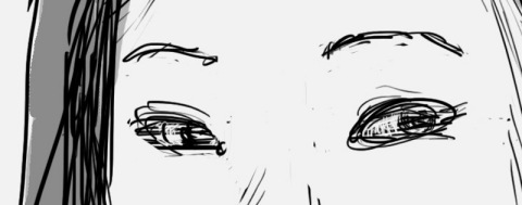
1) The eyes.
The shapes I prefer to use for eyes has evolved over the years. When I was in high school, I used an almost rectangular style to draw eyes that was heavily influenced by the (comic book penciller) Jim Lee ‘school’ of representation that was very popular at the time. I picked up a wider, rounder style upon becoming exposed to the post-art-nouveau work of Egon Scheile. This was combined with the comic work of Chris Bachallo. I’ve alternated this style with a much simpler, more stylized ‘kidney-bean’ shape. Not realistic, but also less derivative of any other styles out there.
Lately, I’ve sought to develop a more realistic, more voluminous method of depiction. You can see this in the way the nearer eye is shaped differently than the farther one. I’ve attempted to show how the eye-lid wraps around the sphere of the eyeball and interacts with the depression of the ocular cavity (the hole in which your eye is housed).
On the nearer eye, the depth of the eye sitting in the socket is suggested with the shadows above the lid and extending out slightly on either side. On both, the volume of the eyeball is also indicated underneath the eye with the lines that show the skin wrapping around it. Finally, I attempted to set the farther eye behind the bridge of the nose more than I’m used to. This effect would be lessened in some Asian faces, and in anyone whose eyes are less deeply set, or whose nose projects out less.
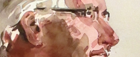
2) The mouth.
Lately, I’ve been vexed by the limitations of my mouth-drawing abilities. I think the root of this problem lies in not really understanding the different planes and surfaces involved in the mouth. Mouths are pretty interesting because they seem simple, but their shape is actually quite complex. Their contours are affected not only by their own unique shapes or the lips, but also the way they interact with teeth, and the fat and muscles surrounding them, like the cheeks and the chin.
Here, I’ve tried to show some of this by again wrapping the mouth around the shape of the skull, and by stressing the overlaps of the top and bottom lip. Finally, I tried to indicate that the lips are not flat, but tilt in towards the interior of the mouth.
3) The nose.
Minor innovations here. In the drawing, I’ve indicated with a light horizontal line where the plane of nose wraps underneath at the lower tip. This is reinforced with some subtle shading of color both on the nose itself and under it; above the lip. It helps give the nose the feeling of projecting out from the face.
A final aspect to note is the mottled coloring. I had noticed some illustrators online whose drawings have a slightly softened, mottled feel to the colors. The effect is reminiscent of the surface of an old comic-book. I discovered some vague instructions for how to acheive the effect in Photoshop using the ‘mezzotint’ and ‘blur’ filters. Maybe if enough people ask, I’ll do a tutorial on it someday…
There are some other things going on here, but I’ll leave that for you all to discover and comment on.